

Data Visualization in Action: Insights, Tools, and Common Pitfalls to Avoid
- Dec 5, 2024
- 6 min read
What is Data Visualization?
Data visualization is the art of transforming raw data into visually compelling stories. By leveraging the power of charts, graphs, and other visual elements, we can unlock hidden insights, identify trends, and make data-driven decisions.
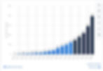
According to Statista, the amount of data created, captured, copied, and consumed worldwide has been on a phenomenal upward trajectory. In 2010, this figure stood at a relatively modest 2 zettabytes (a zettabyte is equivalent to one trillion gigabytes). Just a decade later, by 2020, the volume had ballooned to 64 zettabytes. This trend shows no signs of slowing, with forecasts predicting a further surge to a mind-boggling 182 zettabytes by 2025.
Why is Data Visualization Important?
According to a Forbes study, a staggering 2.5 quintillion bytes of data are generated daily. This mind-boggling figure underscores the immense challenge of making sense of such vast information.
As technology advances and more devices become interconnected, the volume of data continues to skyrocket. Experts predict that this trend will only accelerate in the coming years. The human brain, however, is not equipped to process such massive amounts of raw data. We need help comprehending numbers beyond a certain scale, often resorting to analogies and abstractions.
This is where data visualization comes into play. By transforming complex data into visual representations, data visualization designers can make sense of the chaos and extract meaningful insights. Through the strategic use of charts, graphs, and other visual elements, they can convey complex information in a way that is both accessible and engaging.
In essence, data visualization is the art of turning data into stories. By visualizing data, we can uncover hidden patterns, identify trends, and make data-driven decisions that drive business growth and innovation.
Here are the key benefits of data visualization:
Enhanced Understanding: Visual representations make complex data more accessible and easier to comprehend.
Improved Decision Making: By visualizing data, we can identify trends, anomalies, and opportunities that might be missed in raw data.
Effective Communication: Data visualizations can convey information more clearly and persuasively than text-based reports.
Increased Engagement: Visualizations can spark interest and curiosity, making data more engaging.
Key Principles of Effective Data Visualization
Here are the key principles to keep in mind when creating effective data visualizations:
Clarity:
Simplicity: Strive for simplicity in your visualizations. Avoid clutter and unnecessary visual elements.
Clear Labeling: Use clear and concise labels for axes, data points, and chart titles.
Consistent Formatting: Maintain consistency in formatting, fonts, and colors throughout your visualization.
Accuracy:
Data Integrity: Ensure the accuracy and reliability of your data.
Appropriate Scales: Use appropriate scales and measurements to avoid distortion.
Avoid Misleading Visualizations: Be mindful of potential biases and distortions that can arise from certain visualization techniques.
Relevance:
Focus on Key Insights: Highlight the most important insights and avoid information overload.
Tailor to Your Audience: Consider the knowledge and interests of your audience when selecting visualizations.
Contextualize Your Data: Provide sufficient context to help viewers understand the meaning of the data.
Aesthetics:
Visual Appeal: Use visually appealing design elements to enhance your visualization's overall look and feel.
Color Palette: Choose a color palette that is both visually pleasing and effective for conveying information.
Layout and Composition: Consider the overall layout and composition of your visualization. A well-organized visualization is more effective.
By adhering to these principles, you can create data visualizations that are both informative and engaging.
Best Practices for Data Visualization
1. Data Preparation:
Clean and Organize: Ensure your data is accurate and free of errors.
Transform and Normalize: Prepare your data for analysis by transforming it into a suitable format.
Handle Missing Values: Decide on appropriate strategies to handle missing data, such as imputation or removal.
2. Choosing the Right Chart Type:
Bar Charts: Ideal for comparing categorical data.
Line Charts: Perfect for visualizing trends over time.
Pie Charts: Effective for showing proportions of a whole.
Scatter Plots: Useful for identifying relationships between variables.
Histograms: Show the distribution of a numerical variable.
Box Plots: Display data distribution, including quartiles and outliers.
3. Color Usage:
Color Palette: Choose a color palette that is visually appealing and easy to interpret.
Color Coding: Use color to highlight key points or differentiate categories.
Color Blindness: Consider color blindness when selecting a color palette.
4. Labeling:
Clear and Concise: Use clear and concise labels for axes, data points, and chart titles.
Font Size and Style: Choose a font size and style that is easy to read.
Avoid Clutter: Keep the labels simple and avoid overcrowding the visualization.
5. Storytelling:
Narrative Arc: Create a narrative that guides the viewer through the data.
Highlight Key Insights: Focus on the most important findings.
Use Visual Cues: Use visual cues like arrows, annotations, or highlighting to emphasize key points.
4 Common Data Visualization Mistakes to Avoid
1. Overcrowding Charts
Mistake: The chart includes too many data points, labels, or elements, making it difficult to identify key insights.
Example Graph: A bar chart showing sales data over several years, but with each bar representing a week rather than a year. This results in a chart with hundreds of bars, overwhelming the viewer and making trends hard to identify.
Fix: Simplify the chart by aggregating the data into meaningful periods (e.g., yearly or monthly), and ensure only the most critical data is represented.
2. Using Too Many Colors
Mistake: The graph uses too many colors, making it hard for the viewer to distinguish between categories or trends clearly.
Example Graph: A pie chart with 15+ slices in different colors. The multiple colors confuse the viewer and dilute the importance of the most significant categories.
Fix: Use a limited color palette and assign colors consistently. For example, use different shades of a single color for related categories, or restrict to 4-5 colors in a pie chart.
3. Misrepresenting Data
Mistake: The chart distorts the data by using an inappropriate scale, leading to misleading visual effects.
Example Graph: A bar chart that starts the Y-axis at a value other than zero, exaggerating differences between categories that aren't as significant. For instance, if the Y-axis starts at 100 instead of zero, small differences in the bars appear much larger than they are.
Fix: Always ensure that the Y-axis starts at zero (unless there's a very specific reason to do otherwise) and avoid using 3D effects or overly dramatic visual treatments that misrepresent data proportions.
4. Neglecting Data Context
Mistake: The graph lacks context, making it difficult for viewers to understand how the data was gathered or what it represents.
Example Graph: A line chart showing a drop in sales without explaining that the data was collected during a global pandemic, which could have skewed results. The lack of context leads to misinterpretations of the graph's implications.
Fix: Always provide sufficient context in the chart, such as the data source, methodology, and any relevant conditions that could affect interpretation. You could add a small note explaining these details below or within the graph.
Powerful Tools for Data Visualization
To effectively bring your data to life, you'll need the right tools. Here are some of the most popular and powerful data visualization tools and software:
Business Intelligence Tools
Tableau: Tableau is a leading business intelligence (BI) tool known for its user-friendly interface and powerful data exploration capabilities; Tableau allows you to create stunning visualizations with ease. It's ideal for interactive dashboards and ad-hoc analysis.
Power BI: Microsoft's data visualization tool, Power BI, seamlessly integrates with other Microsoft products like Excel and SharePoint. It's great for creating interactive reports and dashboards.
Data Science Tools
Python: Python, with libraries like Matplotlib, Seaborn, and Plotly, offers immense flexibility for data visualization. From simple plots to complex interactive visualizations, Python can handle it all.
R: A statistical programming language, R is especially popular among data scientists and researchers. It provides a wide range of packages for data visualization, such as ggplot2 and plotly.
General-Purpose Tools
Excel: While primarily a spreadsheet tool, Excel can be used for basic data visualization. It offers a variety of chart types, including line charts, bar charts, pie charts, and scatter plots.
Elevate Your Business with TekinvaderZ
TekinvaderZ is your trusted partner in harnessing the power of data and technology. We specialize in providing innovative data solutions that drive business growth and efficiency. Our team of experts empowers organizations to make data-driven decisions, streamline operations, and stay ahead of the curve.
Contact us today to explore how TekinvaderZ can help you achieve your business goals.